Choosing the right colors for your high-end furniture can feel daunting. This guide simplifies the process into five clear steps, helping you create a cohesive and stunning interior that reflects your personal style and the quality of your investment pieces.
Foundation First: Start with Your Room’s Palette
Before you even look at fabric swatches for that new sofa, take a step back. The most effective premium fabric coordination begins with the existing elements in your space. Look at your walls, flooring, and any fixed architectural details or large art pieces. These form your foundational color scheme. I always tell my clients to treat these elements as the canvas. Your luxury upholstery is the masterpiece that needs to harmonize with that canvas, not fight against it. If your room feels a bit neutral or monotone, that’s actually a fantastic starting point—it gives you the freedom to introduce a beautiful, bold color through your furniture.
The Trusty 60-30-10 Rule
This is a classic interior design principle that works wonders. Think of your room’s colors in these proportions: 60% is your dominant shade (usually walls and large rugs), 30% is your secondary color (think drapery or a significant piece of furniture), and 10% is your accent (throw pillows, art, or a smaller chair). When you’re planning your high-end furniture color scheme, decide which role your new piece will play. Is it going to be that bold 30% secondary statement, or a subtle part of the 60% foundation? This framework takes the guesswork out of creating a balanced look.
Understand the Undertones
This is the secret weapon in any designer upholstery color guide. Every color has an underlying tone—warm (hints of red, yellow, or orange) or cool (hints of blue, green, or purple). A beige wall can be warm (creamy) or cool (grayish). A gray sofa can lean warm (taupe) or cool (slate). The magic happens when undertones are in harmony. Mixing warm and cool undertones in the same space can make things feel “off,” even if the main colors seem to match. Lay your fabric swatch against your wall and floor. Do they feel cohesive? If one looks noticeably yellow or blue next to the other, you’ve found a undertone clash. Sticking to a consistent undertone family creates a seamless, sophisticated flow.
Texture is Part of the Color Story
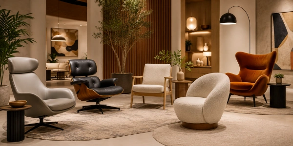
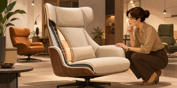
With luxury materials, color isn’t just about hue. A rich velvet in emerald green tells a completely different story than a sleek silk in the same shade. Texture affects how light interacts with the color, making it appear deeper, softer, or more vibrant. When you’re working on luxurious interior color matching, consider the material’s texture as part of its visual weight. A nubby wool bouclé in a neutral tone can add wonderful depth next to a smooth leather armchair. Don’t be afraid to mix textures even within a similar color family; it adds incredible richness and prevents a flat, one-dimensional look. It’s how you achieve that layered, collected-over-time feel.
The Non-Negotiable Lighting Test
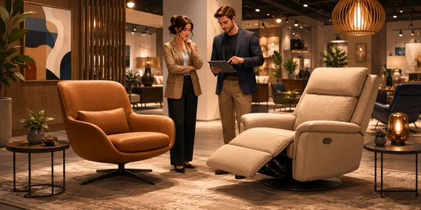
Here’s a step you must not skip! Colors transform under different lighting. That perfect dove gray fabric might look beautifully soft in the showroom’s warm lighting but can appear cold and blue under your home’s cool LED bulbs or in north-facing natural light. Always, always get a sizable swatch. Tape it to your piece of furniture (or where it will go) and observe it for at least 24 hours. Look at it in the morning light, the afternoon sun, and under your evening lamps. This real-world test is the cornerstone of any practical fabric and finish coordination process. It’s the best way to avoid costly disappointment and ensure your chosen color feels right at home in all conditions.
Build Confidence with a Final Touch
You’ve chosen your foundation, harmonized the undertones, celebrated texture, and tested the lighting. Now, how do you pull it all together with certainty? My favorite trick is to create a physical mood board. Gather your fabric swatch, a paint chip from your wall, a snippet of your rug or flooring, and even a photo of key art. Lay them all together on a white board. This tangible collection lets you see the full bespoke upholstery shade selection story at a glance. Does something stick out awkwardly? This is your chance to adjust. Often, introducing a unifying element—like a throw pillow that bridges two colors or a metallic finish repeated in accessories—can lock in the entire scheme. For more on color theory fundamentals, resources like the Pantone Color Institute offer great insights. Trust your eyes and the process you’ve just walked through. You’ve got this!